Skip to main
Link
Miriam on stage talking and gesturing
in front of a projection screen
wearing a yellow leather jacket
and white-blue-pink lightning-bolt earrings

Embracing the Universal Web

CSS-Tricks asked a number of web builders the same question…

What about building websites has you interested this year?

There are constantly new features appearing in browsers – from subgrid to variable fonts to better developer tools. It’s a really great time to be re-thinking everything we know about design on the web. Responsive design has served us well over the years, but it’s still rooted in the limitations of the web from 2010. Ten years later, we’re able to create more “Intrinsic” designs (a term coined by Jen Simmons) and hopefully re-think some “best practices” that are now holding us back.

See more at CSS-Tricks »

That’s exciting but even more interesting to me in the context of a universal web. I began my career during the height of the Web Standards Project, CSS Zen Garden, Designing with Web Standards, and A Dao of Web Design – saturated in the philosophy of universally accessible design. CSS was relatively new, and explicitly designed to balance the desires of a web-creator (like me) with the needs of each individual user (also me), on any number of devices. Terms like “progressive enhancement” and “unobtrusive JavaScript” dominated the industry. We were moving away from “only works in X browser” warnings, to embrace an accessible and resilient user-centered medium.

Over the years, some of those concerns have become industry best-practice. CSS is now standard, and responsive design is the norm. But I also see (and build!) more and more apps targeted at a narrow range of modern, evergreen browsers. Or we ignore new features for years in order to support a browser like IE11. We’ve become resigned to a sense that browser support is binary, and we can only use the features that exactly match our “supported” browsers.

There are many reasons for that shift, including excitement around very cool new features. I don’t think it’s surprising for an industry to have these cycles, but I do think it’s time to reflect on where we’re heading. New CSS features are designed with universal accessibility in mind, and we also have new features for managing browser-support on a continuum, much like viewport-size.

Whatever we want to call it Intrinsic Design, Resilient CSS, Progressive Enhancement, Universal Accessibility, or something else – I think we’re poised for a new movement and a new era of web creation. It’s time for us to take the lessons we learned from Responsive Web Design, adapting to screen sizes, and expand out: adapting to screen readers, legacy browsers, “smart” speakers, and any number of other interfaces.

I’m interested in new methodologies and conventions that move past managing specificity and cascade, or phones and laptops, to help us all manage accessibility and universal compatibility. I’m interested in finding ways to embrace all that is wonderful and new on the web, without abandoning the beautiful vision of a universal web.

We have the tools. Let’s do this.

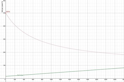
  1. A graph showing font size and zoom effectiveness versus viewport width. The font size, calculated as calc(17px + 2.5vw), increases linearly with viewport width. The 500% zoom line, representing the maximum possible zoom, shows that zoom becomes less effective as viewport width increases, failing to provide a 200% font size increase beyond a viewport width of 2040px.
    Link post type

    Responsive and Fluid Typography with Baseline CSS Features

    As designers, it makes sense to think about what space is available in the browser, and adjust your typography accordingly. It’s also important to remember that different users will have different font-size needs – and the more a font size is responsive to the viewport, the less responsive it will…

    see all Link posts
  2. Indoor plants in pots on a floating shelf
held up by brackets.
    Link post type

    Sass Indented Syntax Improvements

    Bringing SCSS flexibility to .sass files

    The Sass indented format is getting more flexible with the ability to have multiline statements, semicolons, and more.

    see all Link posts
  3. Sass logo in black
on top of bright oklch color gradient
    Link post type

    Sass Color Spaces & Wide Gamut Colors

    Inspect and manipulate the new CSS color formats in Sass!

    CSS has a range of new color functions that support wider color gamuts (like display-p3) and perceptually uniform color adjustments (like oklch). Sass now provides additional tools for working with these new color formats, and converting between them.

    see all Link posts