Tools for Developers
With special guest Kilian Valkhof
Kilian Valkhof, Miriam Suzanne, and James Stuckey Weber talk about developer tools including the Polypane browser and other accessibility tools.

With special guest Kilian Valkhof
Kilian Valkhof, Miriam Suzanne, and James Stuckey Weber talk about developer tools including the Polypane browser and other accessibility tools.

A guide to using new color spaces & formats with OddContrast
OddBird’s color tool not only checks contrast ratios, but supports the new CSS color formats and spaces.

CSS Q&A Party
Miriam Suzanne and Stacy Kvernmo answer questions from listeners about CSS – what the next big evolution for CSS may be, how to make a site more accessible, whether float is still useful, and what’s on their CSS wish list.

Display color gamut ranges and more
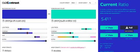
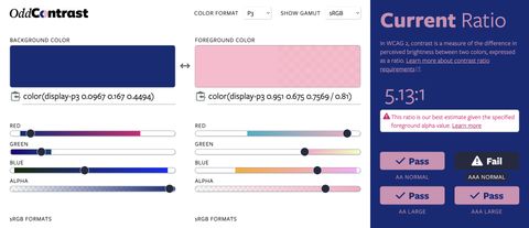
OddContrast, OddBird’s color format converter and contrast checker, gets new features – including the ability to swap background and foreground colors, and display color gamut ranges on the color sliders. Contrast ratios now incorporate foreground color alpha values.

Miriam Suzanne, Stacy Kvernmo, and James Stuckey Weber demo how to use new color formats with OddContrast, a color tool for previewing, accessibility testing, and selecting the format/space.

CSS-Tricks asked a number of web builders the same question…
“What about building websites has you interested this year?”
There are constantly new features appearing in browsers – from subgrid to variable fonts to better developer tools. It’s a really great time to be re-thinking everything we know about design on the web. Responsive design has served us well over the years, but it’s still rooted in the limitations of the web from 2010. Ten years later, we’re able to create more “Intrinsic” designs (a term coined by Jen Simmons) and hopefully re-think some “best practices” that are now holding us back.

How do you select a set of colors that express the attitude of your brand, look great together, and pass WCAG accessibility standards? How many colors is too many? This step-by-step guide outlines OddBird’s process for tackling these challenges. It’s important to define your brand goals first and review…

How do you choose the best fonts for a brand identity among the thousands of options available on the interwebs these days? Whether you’re starting from scratch or rebranding like us, this step-by-step guide can help focus and direct your process. First, define your brand goals. Next, explore your options…