Make the Web a More Colorful Place!
A guide to using new color spaces & formats with OddContrast
OddBird’s color tool not only checks contrast ratios, but supports the new CSS color formats and spaces.
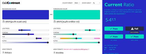
A guide to using new color spaces & formats with OddContrast
OddBird’s color tool not only checks contrast ratios, but supports the new CSS color formats and spaces.
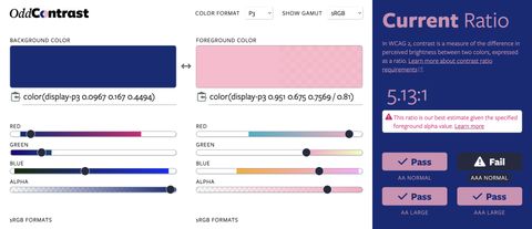
Display color gamut ranges and more
OddContrast, OddBird’s color format converter and contrast checker, gets new features – including the ability to swap background and foreground colors, and display color gamut ranges on the color sliders. Contrast ratios now incorporate foreground color alpha values.

Inspect and manipulate the new CSS color formats in Sass!
CSS has a range of new color functions that support wider color gamuts (like display-p3) and perceptually uniform color adjustments (like oklch). Sass now provides additional tools for working with these new color formats, and converting between them.
What I’ve been working on as an Invited Expert
The CSS Working Group has regular face-to-face meetings (hybrid online/in-person) throughout the year, and they always result in a flurry of activity! Here’s a rundown of some highlights from the last few months, with a focus on the features I maintain.

Miriam Suzanne, Stacy Kvernmo, and James Stuckey Weber demo how to use new color formats with OddContrast, a color tool for previewing, accessibility testing, and selecting the format/space.
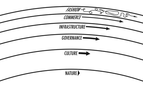
What happens if the ‘pace layers’ get out of sync?
“Ask not just: How well does it work? But also: How well does it fail? What happens when something goes wrong?” —Jeremy Keith

A new proposal for color management in Sass
There’s been a lot of exciting work in the CSS color specifications lately, and since the new features are already starting to land in browsers, we’ve been preparing to add support in Sass as well. My proposal for that is published and ready for public feedback!

Living Style Guide documentation on the web is a difficult problem, gaining a lot of attention in the last few years. Let’s take an in-depth look at one way to store patterns directly in Sass, and generate documentation automatically.

Four useful tools & tutorials
So you’d like to start learning design, but the number of tools and tutorials available is overwhelming. Where do you start? I recommend Paper for sketching out UX ideas, Practical Color Theory for Coders to generate color palettes and learn color theory, Choosing the Right Font: A Practical Guide to…

from Natalya Shelburne
If you write code and you want to delve into design, Natalya Shelburne’s Practical Color Theory for Coders will get you up and running with a beautiful, cohesive, and accessible color palette using Sass color functions, and teach you why her palettes work so well, all at the same time.

How do you select a set of colors that express the attitude of your brand, look great together, and pass WCAG accessibility standards? How many colors is too many? This step-by-step guide outlines OddBird’s process for tackling these challenges.
It’s important to define your brand goals first and review them throughout the process. Next, do some research for inspiration. What colors are the other companies in your field using? Use Paletton to generate a cohesive color palette. Test color contrast to ensure accessibility. Finally, create prototypes to make sure you colors work well in context.